The Story
This is a simple little project that my friend paid me to do.
My friend was starting a travel agency, and needed a logo to help brand himself better to his customers. That's where I came in, and created a logo that he is now proud to use in his business.
Peak Travel LLC
Peak Travel LLC is an independently owned travel agency that seeks to provide quality travel solutions for you - without breaking the bank. Although they are a professional business, Peak Travel LLC also strives for authenticity, giving their customers the best options for their individual needs. Your trust is their utmost priority, and they don't wish to break it.
Name / Tagline / Client
- NAME - Peak Travel LLC.
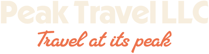
- TAGLINE - Travel at its Peak.
Target Audience
- Young folks who want to travel.
- People who need affordable options.
- People who value authenticity, honesty, and trustworthiness.
Deliverables
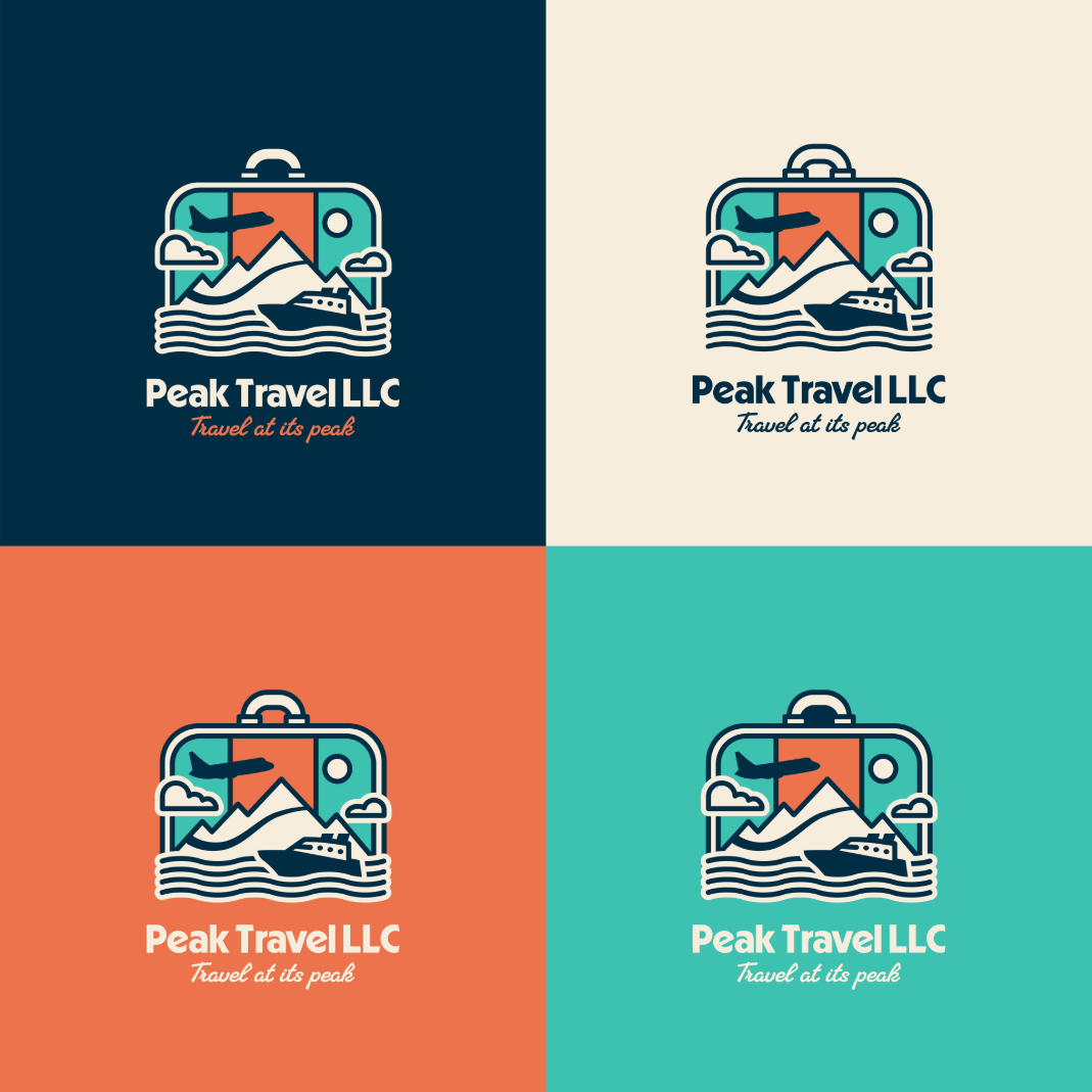
The client only really wanted a logo, so I gave him a few variations.
Goals & Objectives
- The logo must feel authentic.
- The logo must be bold and stand out among others.
- Overall should make Peak Travel's clients think, "Yeah, this looks like the best option for me."
Visual Direction
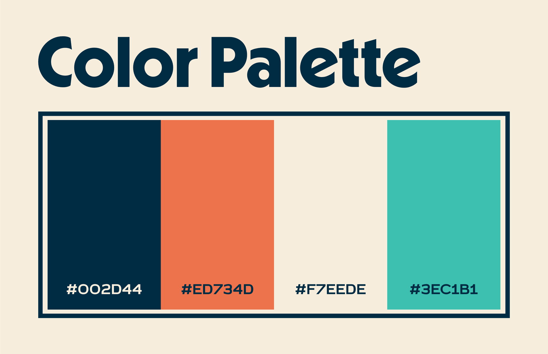
- COLOR PALETTE - bold hues that contrast well while still feeling authentic.
- STYLE - Simplistic without feeling corporate.
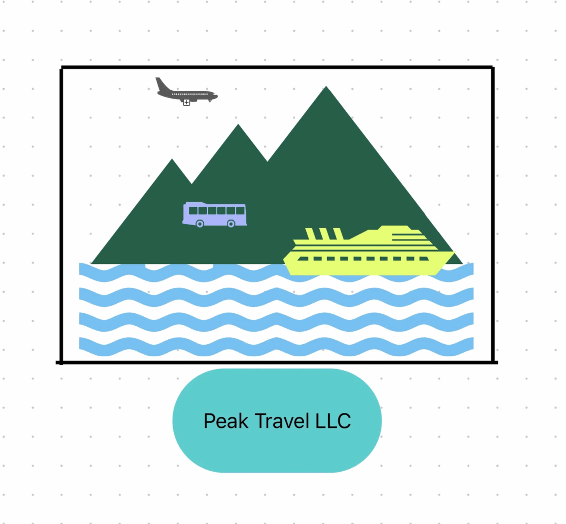
- IMAGERY - Mountain peak is the primary focus, with ideally several forms of travel on the logo.
Brand Identity
- Trustworthy.
- Wanderlust.
- Cozy but also bold.
- Authentic.
- Down to earth
The Process
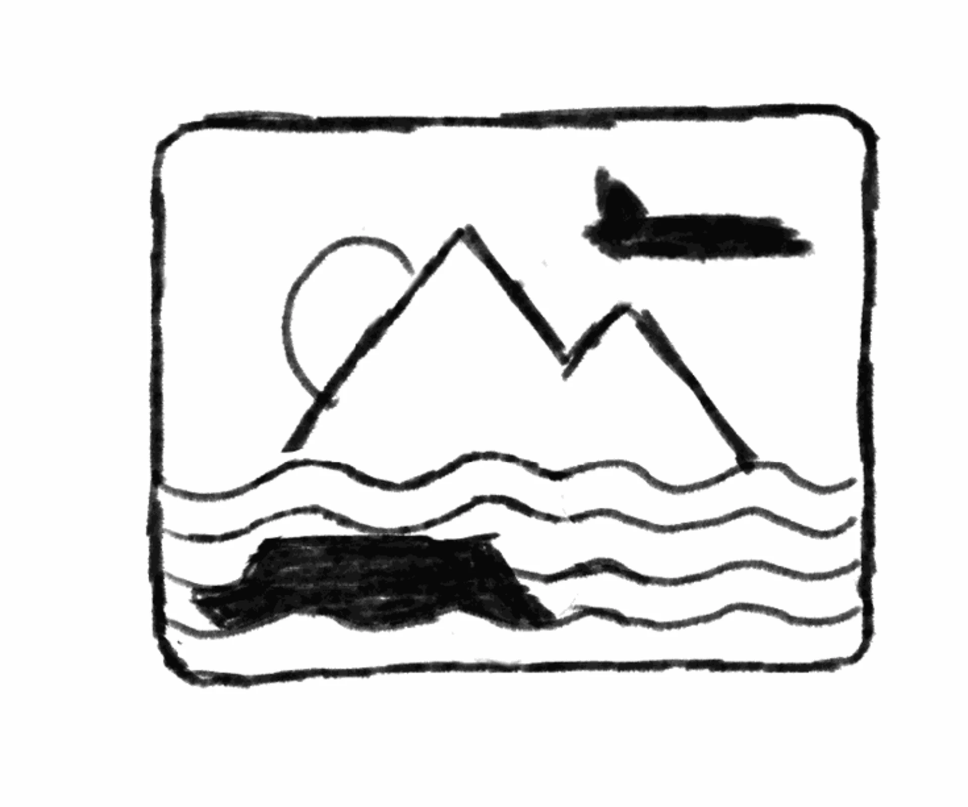
The first image shows his original design concept that he wanted, leading me to make a rough sketch. I underwent multiple versions and revisions before finally coming to a conclusion that we were both happy with.


The Results
Logo + Variations
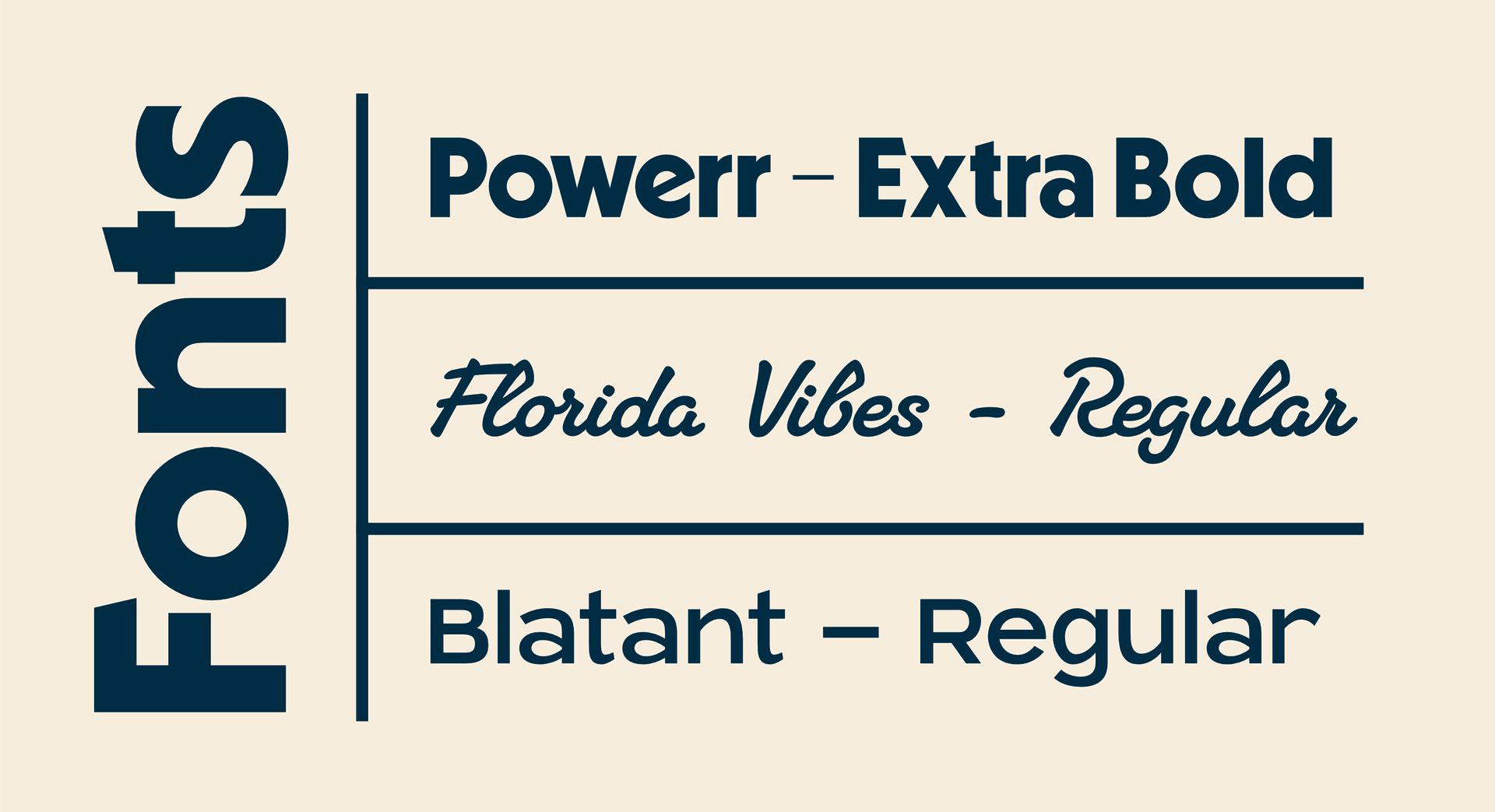
Color Palette + Fonts
Mockups
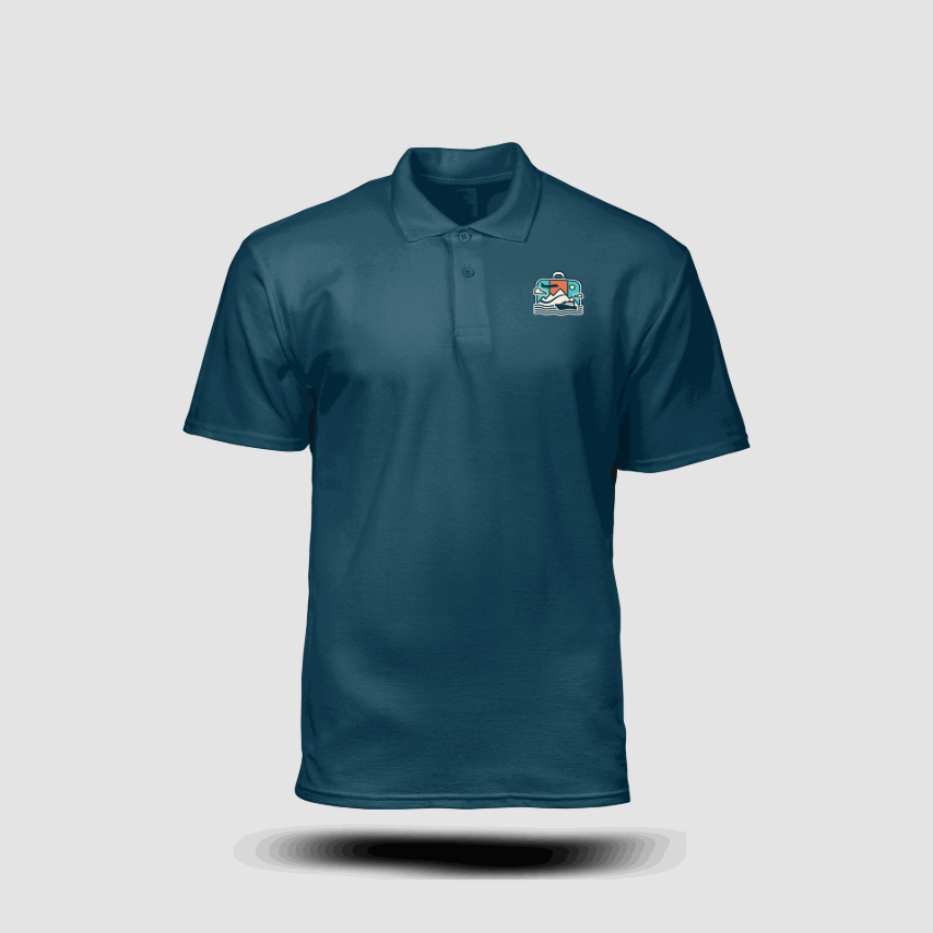
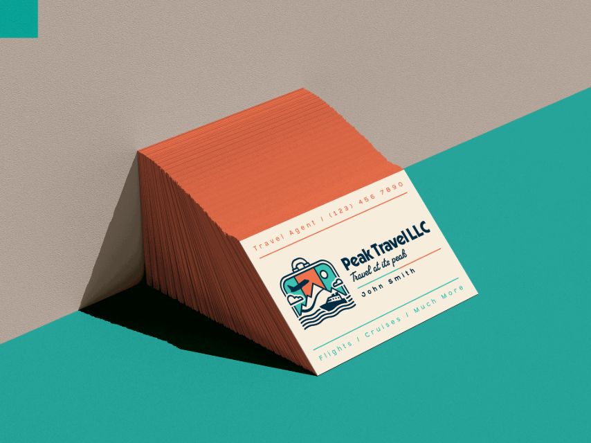
These mockups were not requested by Peak Travels, but I am providing them here to show how the logo might be used in other senses.