The Story
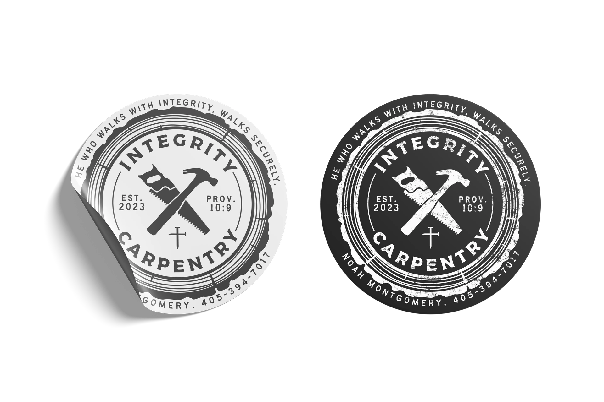
My friend had a logo for his carpentry business that he wasn't very satisfied with, and so he called me up to for a new logo.
He liked his old one, but once again, wasn't very satisfied with how it looked, so he wanted me to spruce it up a bit.
The Reference
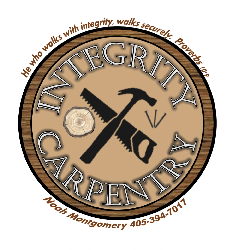
As you can see, the idea of the original was there, but was not executed very well. He wanted the logo to have his information on it whilst also being recognizable at a distance, as he had the idea of using stickers of his logo as his business cards instead of using an actual busness card.
While this design was rough, it gave me a good starting point for what he was going for.
The Result
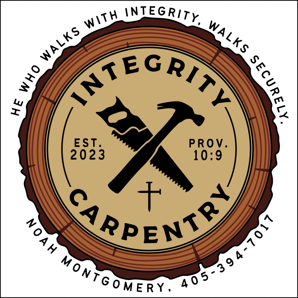
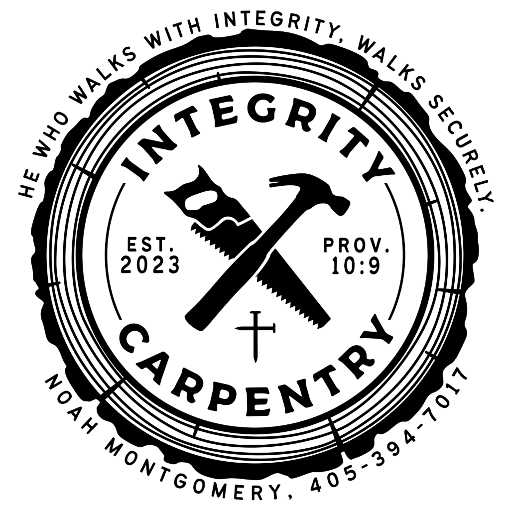
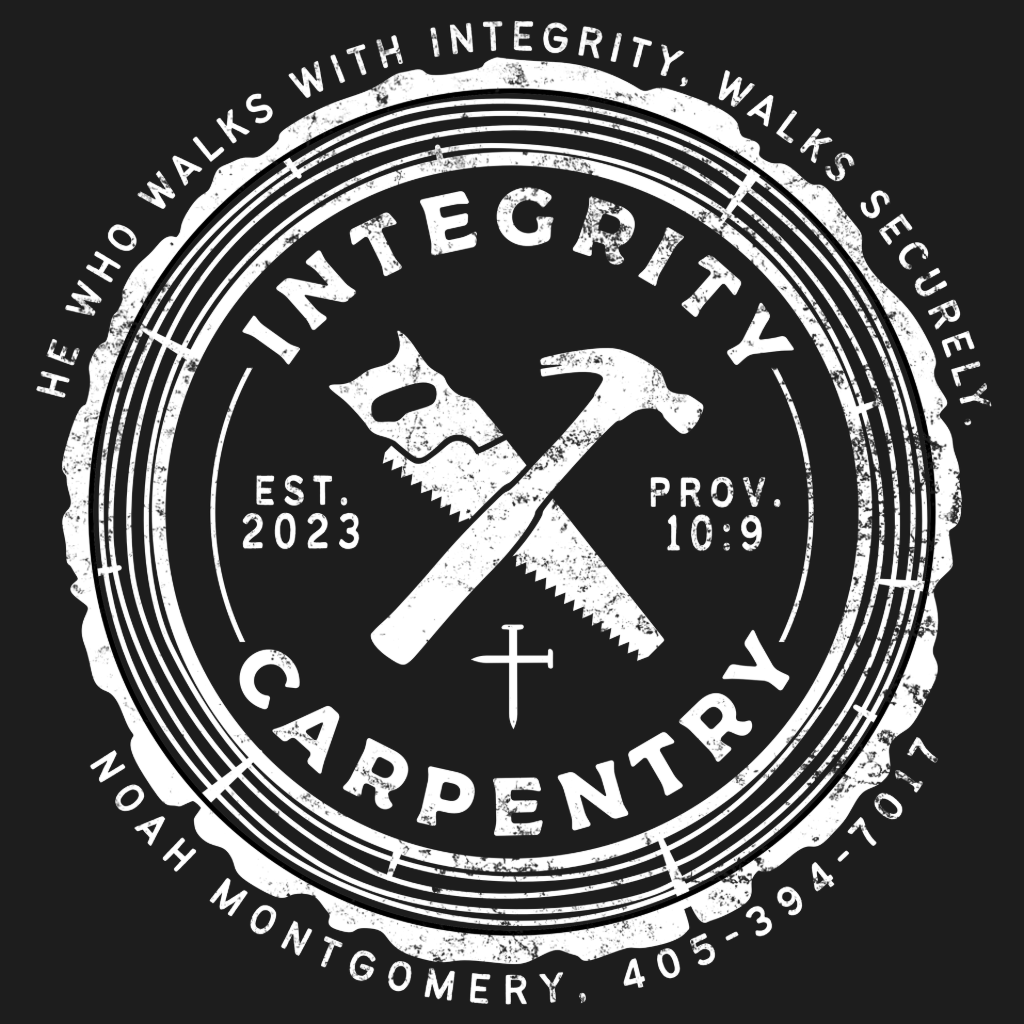
In the new design, I focused on making things cleaner and clearer. I adapted the circle to look like the stump of cut wood, and used fonts that had rounded / blunted edges, giving the design a subtly more natural feel to it. I liked the main idea of the crossed hammer and saw, so I created my own tools from scratch and arranged it in the same orientation.
My friend was satisfied with the result, and still uses this design to this day.
Stickers and Shirt